Overview: AMS Website Experience and Visual Design
Updating the American Mathematical Society’s website with a new global navigation and content-first approach, to promote usability and engagement.
Old homepage:
Homepage Redesigned
The previous homepage was lacking and did not convey the excellence of the AMS as the leading association of professional mathematicians.
With the aim of increasing user engagement and improving the bounce rate, we redesigned the homepage to focus on key AMS offerings: research and publications for the mathematics community.
Designing and testing IA was the first step, as it laid the foundation of a more usable and organized site.
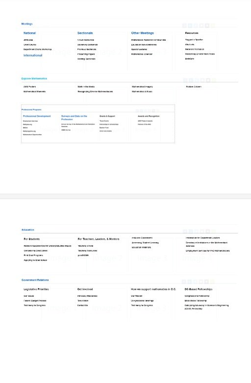
Global Navigation
With the challenge of over 40,000 pages of web content, where does one begin?
After extensive research, usability testing, and analysis, we sorted out the information architecture of the site and designed a more usable menu.
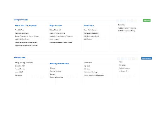
Secondary pages
A lack of structure and clear hierarchy contributed to a messy and illogical user experience.
We cleaned up the secondary landing pages to be consistent, easy to navigate, and accessible so that important destinations are all at users’ fingertips.
Conclusion & Next Steps
By simplifying navigation, tightening the visual language, and creating a more welcoming environment, we designed a more user-friendly AMS website.
After implementing the new global navigation, we received positive user feedback and lowered our bounce rate on the homepage. Having a clear site structure gave users the confidence to find their desired destination.
The redesigned homepage is being rolled out in incremental phases, and we hope to continue our work to improve the AMS web experience.


